Looks
Four looks. Each one a complete system.
A look sets the type, the corners, the outlines and the choreography. Your colours, name and logo stay the same across all four, so switching is one tap.
Stack
Rounded, friendly, calm. Soft corners, a single brand bar, generous spacing. The default for most businesses: it reads as warm and competent without shouting.




Storyboard






In every layout
| |||
| |||
|
|
| |||||||||
 | Rizwan Prasla Founder Planner Wick |  | |||||
||
| |||
| |||
|
Rizwan Prasla Founder | |||||||
| |||||||
Poster
Big condensed type, hard colour. Square corners, uppercase, a solid colour block carrying the photo. Built for brands with confidence and a strong primary colour.




Storyboard






In every layout
| |||
| |||
|
|
| |||||||||
| Rizwan Prasla Founder Planner Wick | | |||||
| |||||||
| |||
| |||
|
Rizwan Prasla Founder | |||||||
| |||||||
Sticker
Thick outlines, hard shadow. A card with a 3px outline and an offset shadow, like a sticker on a laptop. The brand name sits on a tilted chip. Playful on purpose.
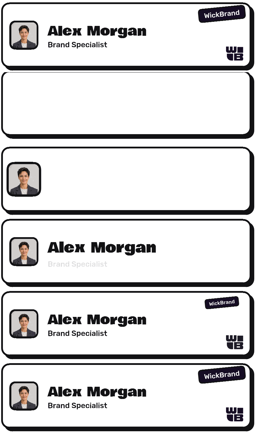



Storyboard





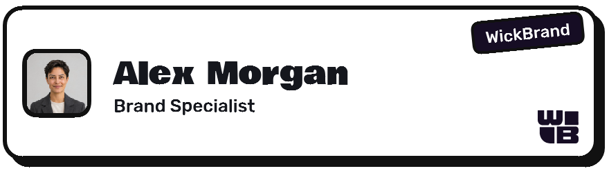
In every layout
| |||
| |||
|
|
| |||||||||
| Rizwan Prasla Founder Planner Wick | | |||||
| |||||||
| |||
| |||
|
Rizwan Prasla Founder | |||||||
| |||||||
Noir
Serif italic on dark. A dark card tinted with your primary colour, an italic serif name and letter-spaced small caps. Quiet and expensive.


Storyboard






In every layout
| |||
| |||
|
|
| |||||||||
| Rizwan Prasla Founder Planner Wick | | |||||
| |||||||
| |||
| |||
|
Rizwan Prasla Founder | |||||||
| |||||||
See them with your brand.
Paste your website and the four looks render with your colours and logo.
Open the studio